Journal/Field Notes

Surface Tension: New York City's Architectural Skin

Over dozens of miles walked across Manhattan over many trips, I stopped paying attention to buildings and started paying attention to what they're made of.

Philippe Lasry··5 min read
56 Leonard Street, TriBeCa - Herzog & de Meuron. Detail of the stacked cantilevered concrete balcony slabs, late afternoon light raking across the raw concrete faces

New York doesn't reward the wide shot. The city is too dense, too layered, too contested - point a camera at a Manhattan block and you get a visual argument, not a photograph. What New York rewards is looking closely at the thing directly in front of you.

I've walked a lot of miles in this city over a lot of trips, and somewhere along the way I stopped trying to make sense of the skyline and started paying attention to facades. To the materials buildings are made of, the way those materials age and catch light, the design decisions that get made at the scale of a single panel or a single floor - decisions that most people never notice because they're looking at the building as a whole or, more likely, looking at their phone.

These images are from those moments. No single shoot, no particular plan. Just a camera and the slow accumulation of details that stopped me mid-stride across years of time in the city.

56 Leonard Street, TriBeCa - Herzog & de Meuron, completed 2016. Detail of the stacked cantilevered concrete balcony slabs, late afternoon light raking across the raw concrete faces
56 Leonard Street, TriBeCa - Herzog & de Meuron, completed 2016. Detail of the stacked cantilevered concrete balcony slabs. Late afternoon light rakes across the raw concrete faces, turning what is essentially a structural element into something that reads as pure warm geometry. The 'Jenga Building' nickname captures the massing logic but misses the material intelligence - at close range, in the right light, the concrete is the whole story.

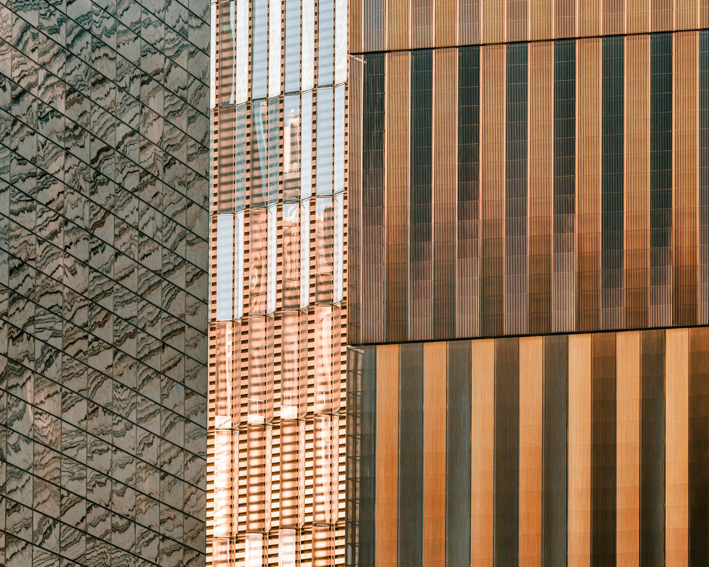
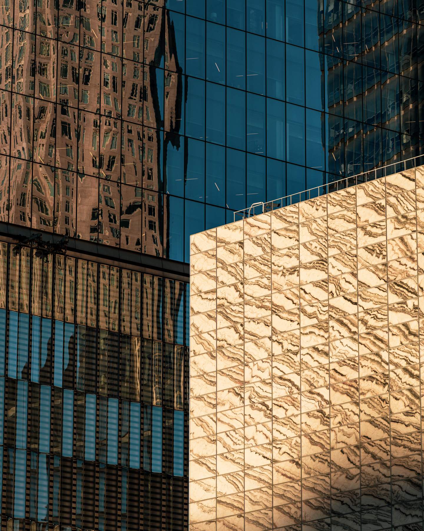
The first thing you learn about New York facades is that material choice is a position statement. Every building in this city is in conversation - sometimes argument - with the buildings around it, the neighborhood it sits in, the era it was built in, and the market it was designed to serve. Concrete says one thing. Glass says another. Stone says something different again, and the distance between what a material communicates at street level and what it communicates from across the river is one of the fundamental tensions of urban architecture.

56 Leonard is making a specific argument with raw concrete: that a luxury residential tower doesn't need to be smooth, reflective, or anonymous to read as premium. The exposed slab edges are the building's primary ornament. Herzog & de Meuron have always understood that material honesty, executed with precision, is more interesting than applied decoration.

One World Trade Center, Lower Manhattan - Skidmore, Owings & Merrill, completed 2014. Detail of the tower's base where the square footprint begins its angular transition upward, faceted glass and steel panels creating a prismatic surface
One World Trade Center, Lower Manhattan - Skidmore, Owings & Merrill, completed 2014. Detail of the tower's base where the square footprint begins its angular transition upward. The faceted glass and steel panels create a prismatic surface that catches light differently on each face - from the street, the base of the building reads as a series of shifting planes rather than a single surface. At close range the geometry is more complex and more considered than the tower's iconic silhouette suggests.

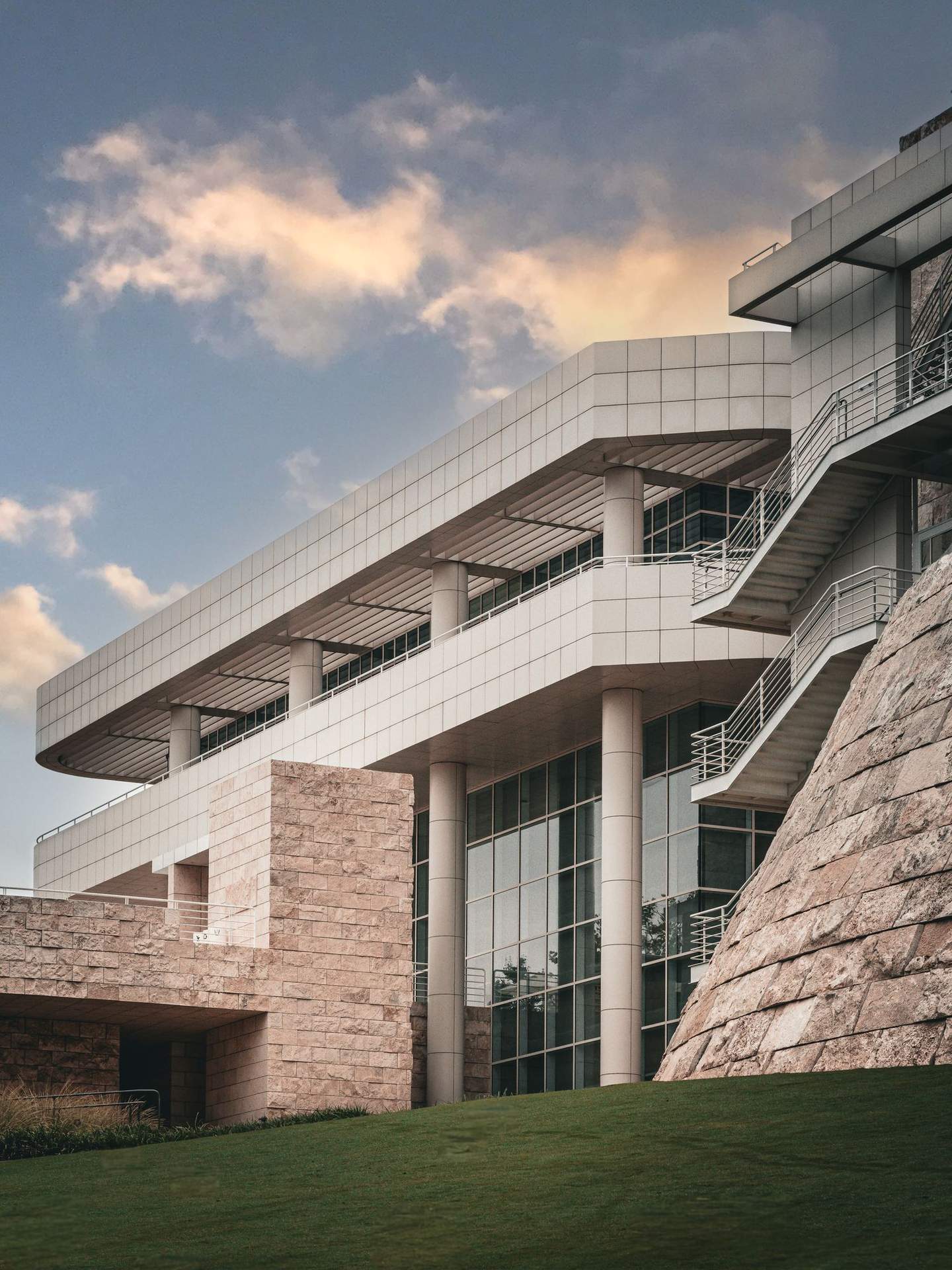
One World Trade is a building that most people experience from a distance - as skyline, as symbol, as the tallest point on the Manhattan horizon. Getting close to it changes the reading entirely. The base geometry, where the building negotiates its relationship with the street before ascending 1,776 feet, is where the architectural intelligence is most concentrated. The angular faceting isn't decorative - it's structural and symbolic, the building's formal response to the site it occupies and the history it carries. From thirty feet away, it reads as pure abstraction.

A Beaux-Arts civic building near Penn Station, Midtown Manhattan - early twentieth century. Detail of the carved limestone cornice frieze, with glass curtain wall towers rising behind
A Beaux-Arts civic building near Penn Station, Midtown Manhattan - early twentieth century. Detail of the carved limestone cornice frieze, with glass curtain wall towers rising behind. The warm stone against the cool blue glass is a material conversation that only New York produces so effortlessly - a century of architectural history compressed into a single frame, neither era apologizing for the other.

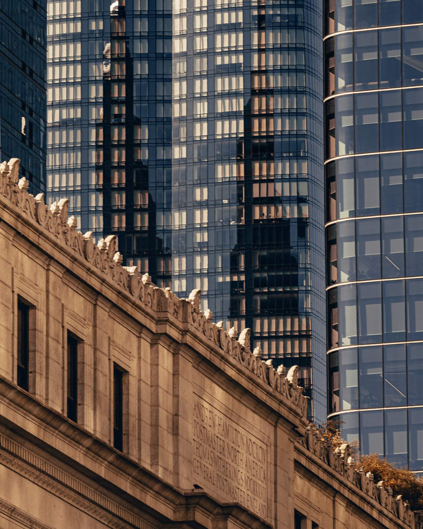
This image is the one that most clearly explains why I walk rather than drive in New York. At street level, with your face tilted up at the right angle, the carved ornamental detail of a Beaux-Arts building - each bracket, each figure, each precisely chiseled letter - sits in the same frame as the curtain wall towers that replaced its neighbors. The stone is warm, hand-worked, obsessively detailed. The glass is cool, machined, anonymous. They coexist without resolution, which is the truest possible portrait of the city.

A Midtown facade corner where a glass curtain wall system meets stone cladding - the precise joint where warm stone terminates and cold glass begins
A Midtown facade corner where a glass curtain wall system meets stone cladding. The reveal between the two materials - the precise joint where warm stone terminates and cold glass begins - is where the architectural decision becomes legible. How a building handles its material transitions tells you more about its design intent than any single surface can.
A KPF-designed commercial tower, Midtown Manhattan. Detail of the curved glass curtain wall - each floor plate wrapped in a continuous radius, horizontal banding of spandrel panels creating a stacked rhythm around the curve
A KPF-designed commercial tower, Midtown Manhattan. Detail of the curved glass curtain wall - each floor plate wrapped in a continuous radius, the horizontal banding of the spandrel panels creating a stacked rhythm around the curve. The sky and surrounding buildings compress and distort across the reflective surface. At this scale and precision, curved glass construction is an exercise in controlled manufacturing tolerance - the gap between the architectural drawing and what actually gets built, measured in millimeters.

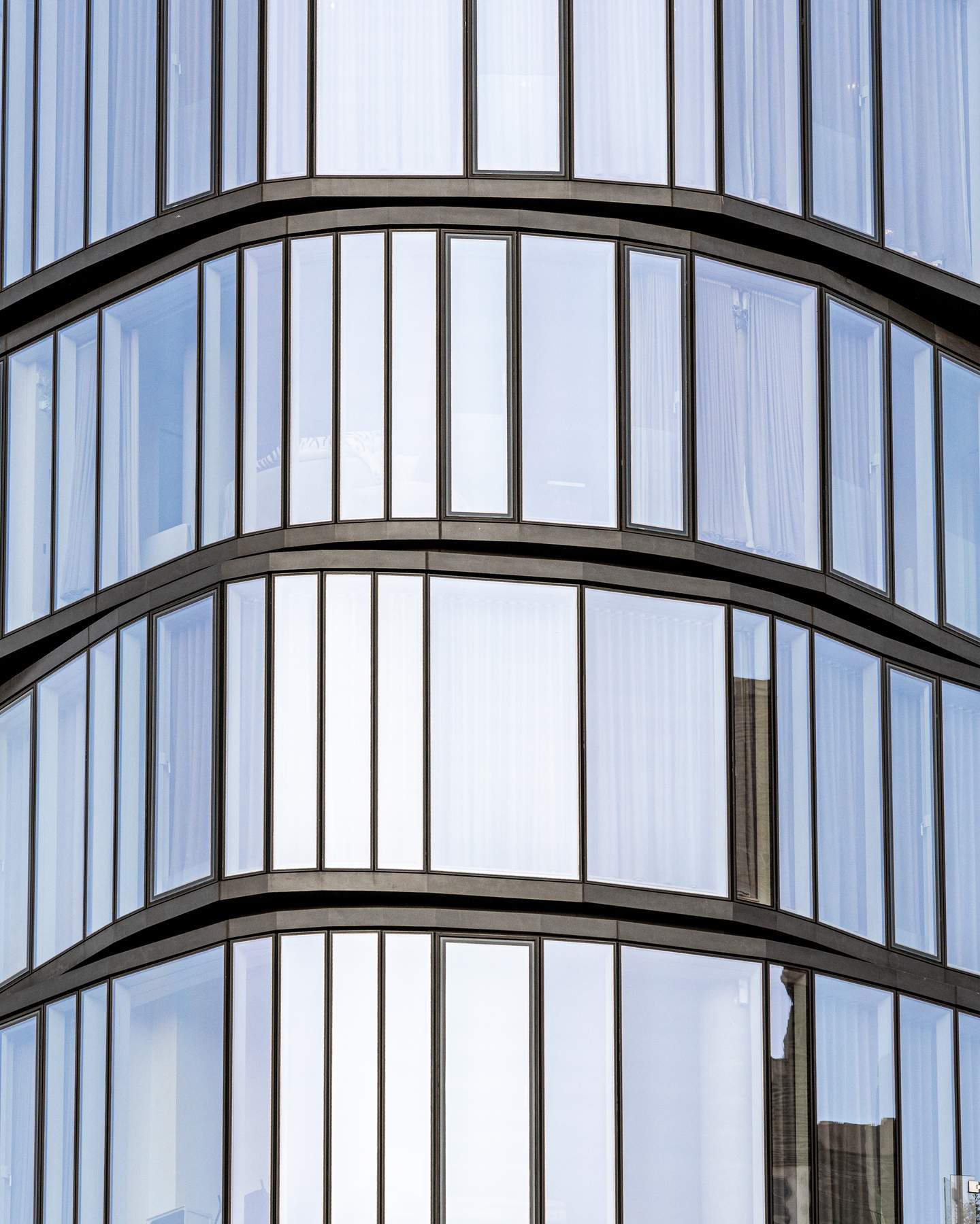
The curved glass building is the one that stops me longest. Standing close enough that the curve fills the frame, the reflections become something else entirely - a compressed, warped version of the surrounding city, bent around the building's form. New York's street grid is relentless and orthogonal. A building that refuses that logic is a provocation. KPF's best commercial work earns that provocation.

520 West 28th Street, Chelsea - Zaha Hadid Architects, completed posthumously in 2017. Detail of the interlocking circular balcony framing system, dark bronze structural rings interlocking in a pattern simultaneously geometric and biological
520 West 28th Street, Chelsea - Zaha Hadid Architects, completed posthumously in 2017. Detail of the interlocking circular balcony framing system. Dark bronze structural rings interlock in a pattern that is simultaneously geometric and biological - the negative space between circles forming a recurring hourglass form that the eye keeps trying to resolve and cannot. This is Hadid's only completed residential project in New York, and the facade system is unlike anything else in the city.

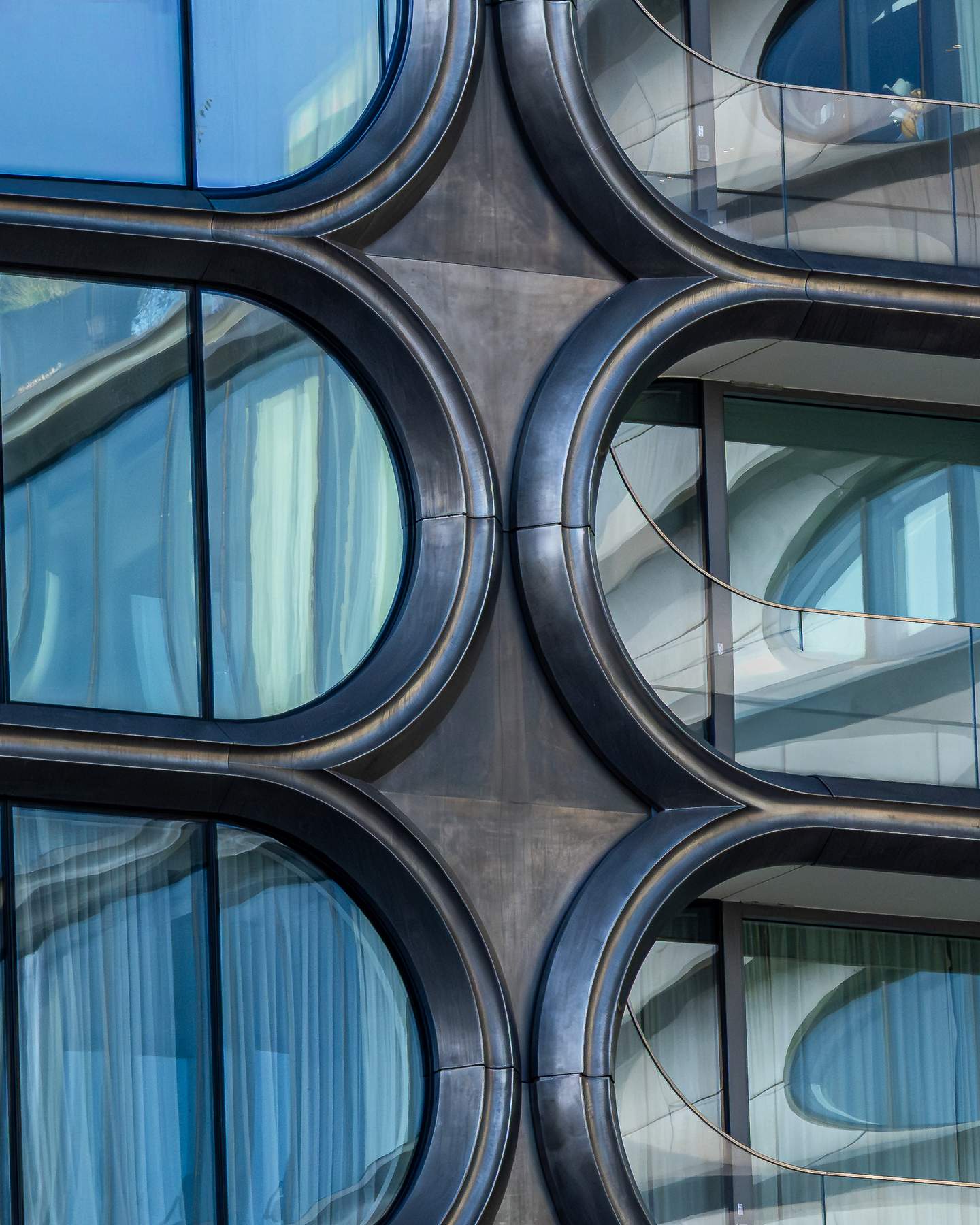
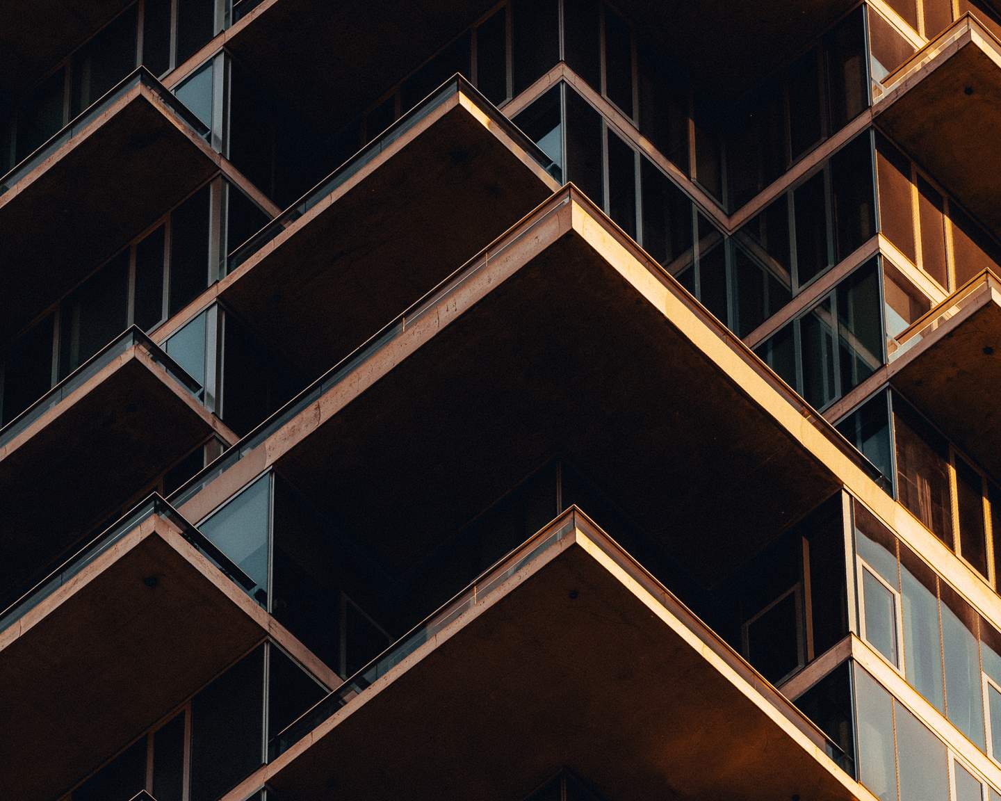
Hadid's 520 West 28th rewards getting close more than any other building in this set. From the street it reads as a striking residential tower with circular balcony forms. Move to within twenty feet of the facade and the building dissolves into something else: the geometry of the bronze framing takes over, the circles and the negative space between them competing for dominance, the blue glass behind each aperture catching the sky at a slightly different angle. The pattern is precise but the effect is organic. That tension - between the mathematical and the intuitive - is what Hadid spent a career pursuing. At close range, on this facade, she achieved it completely.

A Manhattan facade composed of undulating vertical fins - wave-form aluminum elements that create a continuous flowing pattern across the building face, surface appearing to move as viewing angle changes
A Manhattan facade composed of undulating vertical fins - wave-form aluminum elements that create a continuous flowing pattern across the building face. The fins are identical in section but their orientation shifts across the facade, causing the surface to appear to move as your viewing angle changes. From directly in front it reads as a flat pattern; from an angle the three-dimensionality of each fin becomes visible and the whole surface activates.

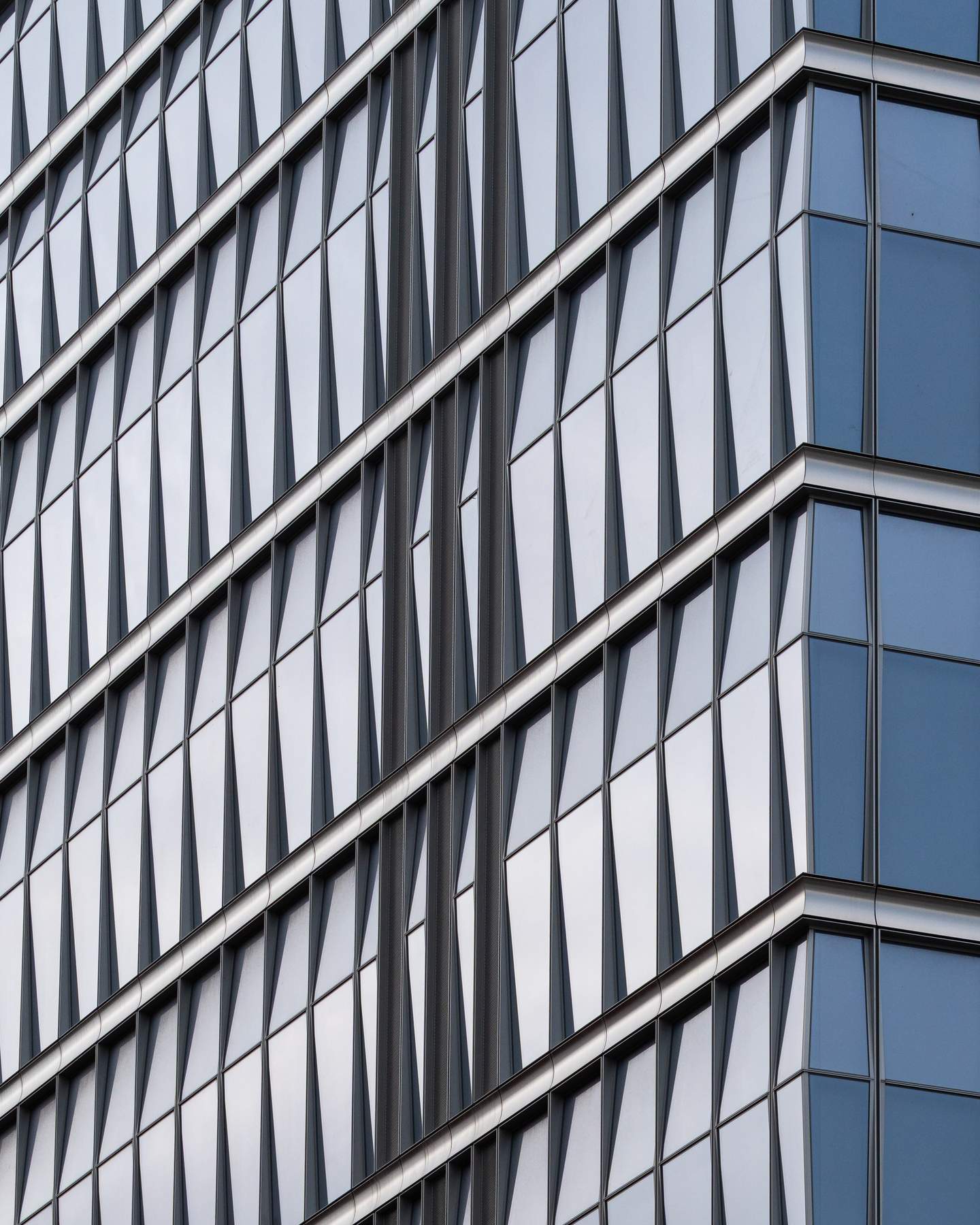
This is the image that surprised me most in editing. On the street I shot it quickly, drawn by the pattern but not fully understanding what I was looking at. Reviewing it later, the sinuous movement of the fin system - the way the surface appears to breathe - is more sophisticated than I registered in the moment. Someone spent real design effort on a facade system that most people walk past without stopping. That's the kind of decision that only makes sense if you believe architecture is for the city as much as for the client.

A facade system of overlapping rhomboid panels creating a continuous diagonal grid across a curved building surface, curvature causing the pattern to compress and shift subtly across the frame
A facade system of overlapping rhomboid panels creating a continuous diagonal grid across a curved building surface. The curvature of the building causes the pattern to compress and shift subtly across the frame - what appears to be a flat repeating grid is actually mapping itself onto a three-dimensional form. Pure surface. Pure pattern. The closest thing in this set to an image that has nothing to do with architecture and everything to do with geometry.

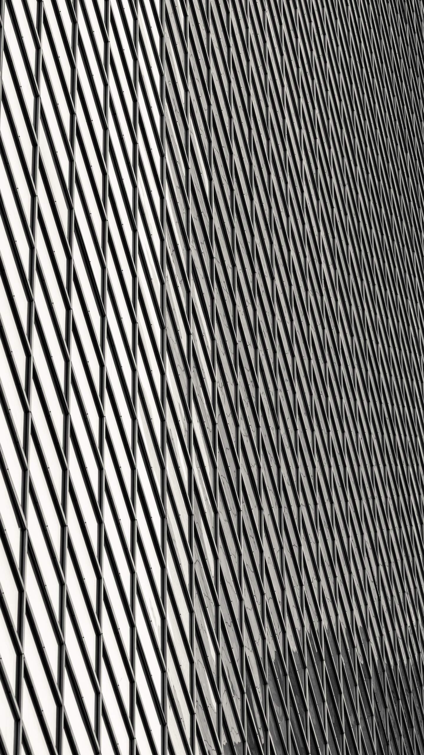
The diamond grid image is where the series ends because it's where documentation stops entirely. There's no readable building here, no historical context, no named architect. Just a surface doing something interesting in the light. Which is, in the end, what all of these images are about - the moment when a building stops being a building and becomes something you want to stand in front of for a while.


New York will keep making these surfaces, block by block, facade by facade, material by material. The skyline gets the attention. The skin deserves it.

Tags

architecture photographyNew York CityManhattanarchitectural texturefacade designHerzog de MeuronZaha HadidKPFOne World Trade Center56 Leonard520 West 28thfield notesurban architecture